Counselly App
Overview
Counselly is a mobile application that helps connect people with mental health needs to professionals, experts and therapists. This is a project from my continued education with Career Foundry.
Roles
Roles
Research
User Testings
UX Design
UI Design
Photography
Research
User Testings
UX Design
UI Design
Photography
Responsibility
Responsibility
Research
Information Architecture
User Flows
Wireframes
Usability Testing
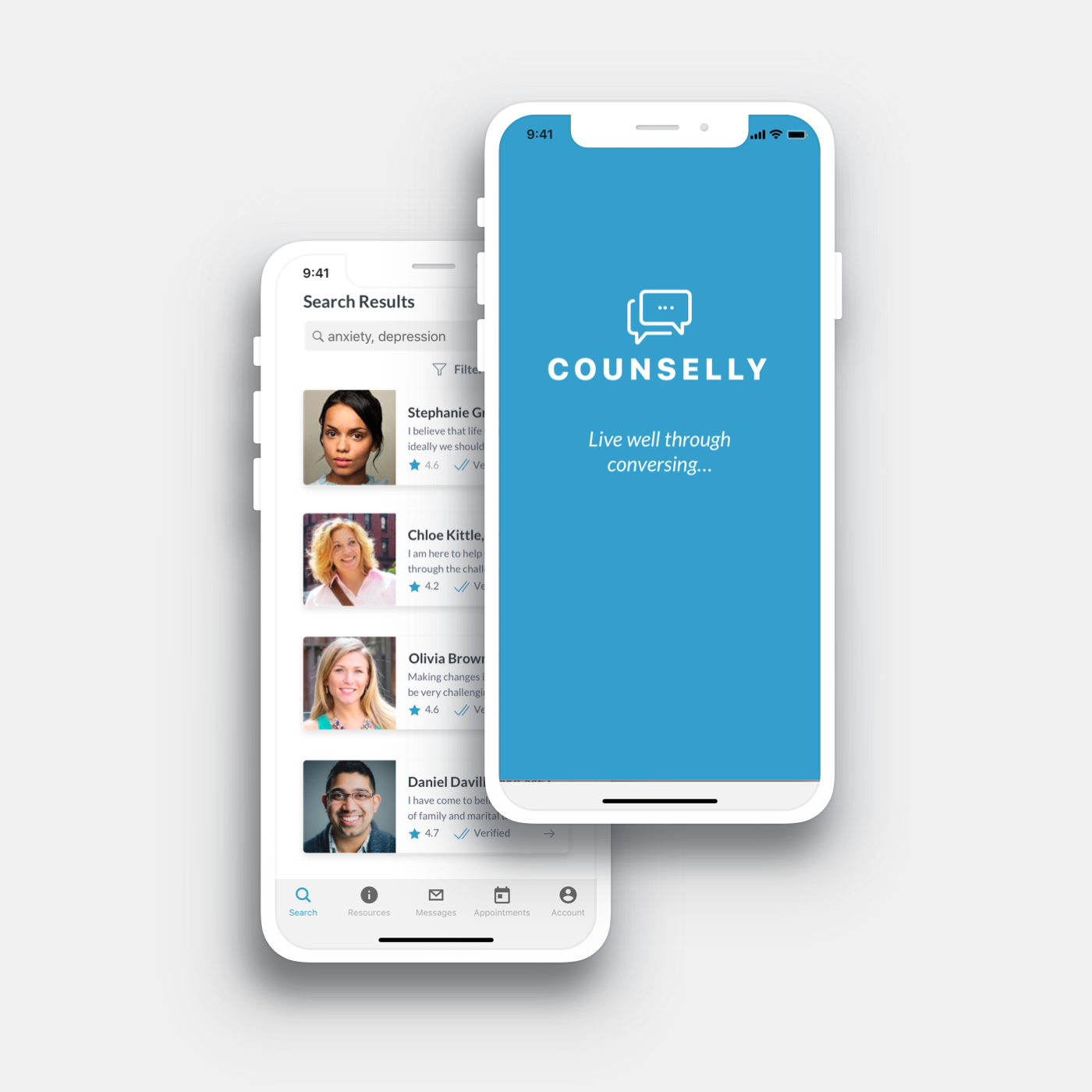
connecting people to professionals and therapists
Design Process
Discover and Empathize
What's the problem? Define the challenge and explore human context.
Define
What is important? Research, observe and understand.
Develop and Ideate
Brainstorm ideas good and bad. Explore possible solutions.
Prototype, test and deliver
How can we create it? Start creating and experimenting. Refine, test and launch.

Discovery
I did a SWOT Analysis and performed both user surveys and in-person interviews. Surveys were created through forms and sent out to various groups of people. I met with people in person and through video conference calls.
Discovery
In this phase, I performed both user surveys and in-person interviews. Surveys were created through forms and blasted out to various groups of people. I met with people in person and also through video conference calls.
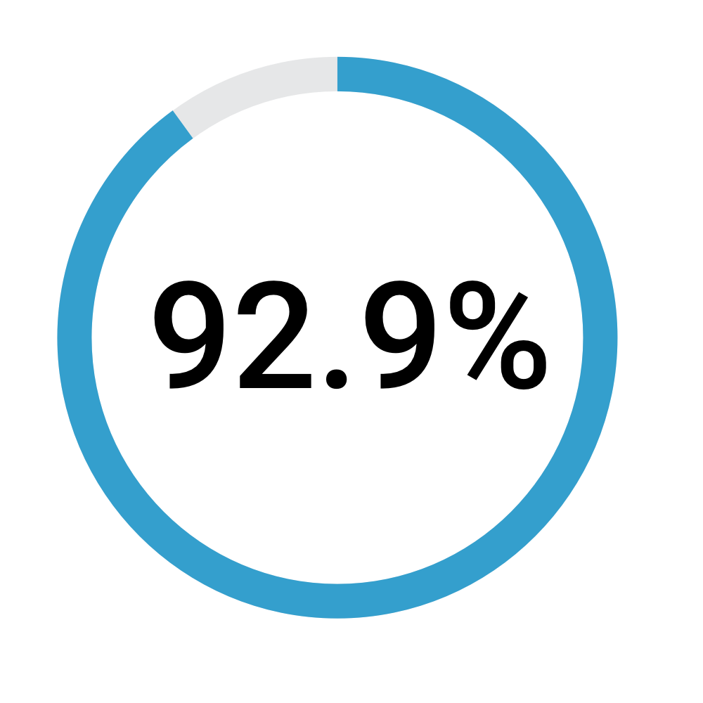
Do you or someone you know have a mental health condition? 92.9% of people surveyed answered yes.
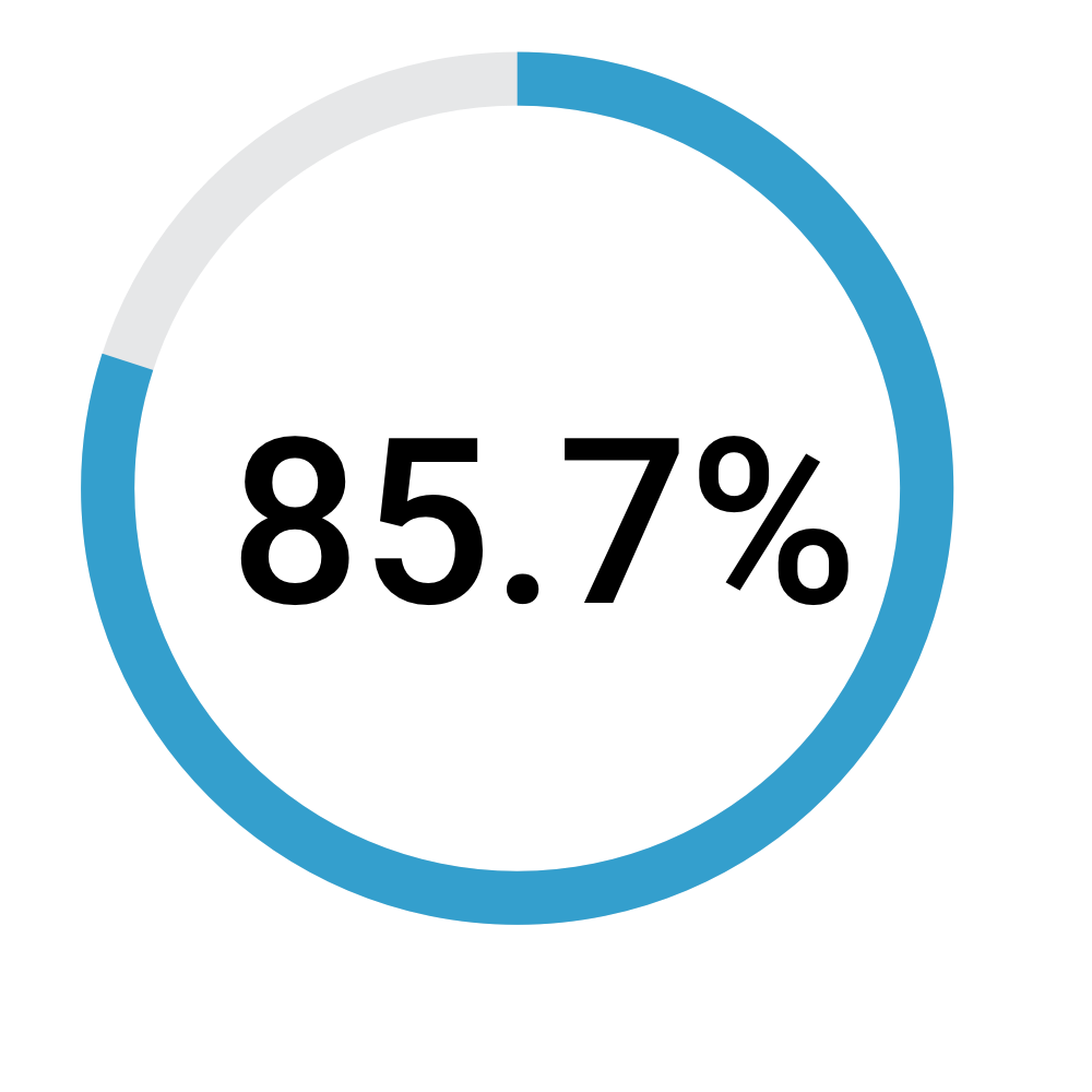
Would you use an app on your mobile device to learn more about mental health? 85.7% of people said they would.
“I’d like to know my doctor is certified”
“The professionals need to be legit”
“I don’t know a whole lot about mental health”
Problem Statement
A person who is overwhelmed by the task of finding and evaluating a mental health professional needs simple guidance from a trusted source to unlock a life of healthy balance.

Possible Solutions
A solution is to create a mobile app where you research and evaluate expert professionals in the mental health field. Simply browse the topic and connect with verified professional therapists via messaging or schedule a video call.
Solution
A solution is to create a mobile app where you research and evaluate expert professionals in the mental health field. Simply browse the topic and connect with verified professional therapists via messaging or schedule a video call.
Usability Testing and Affinity Mapping
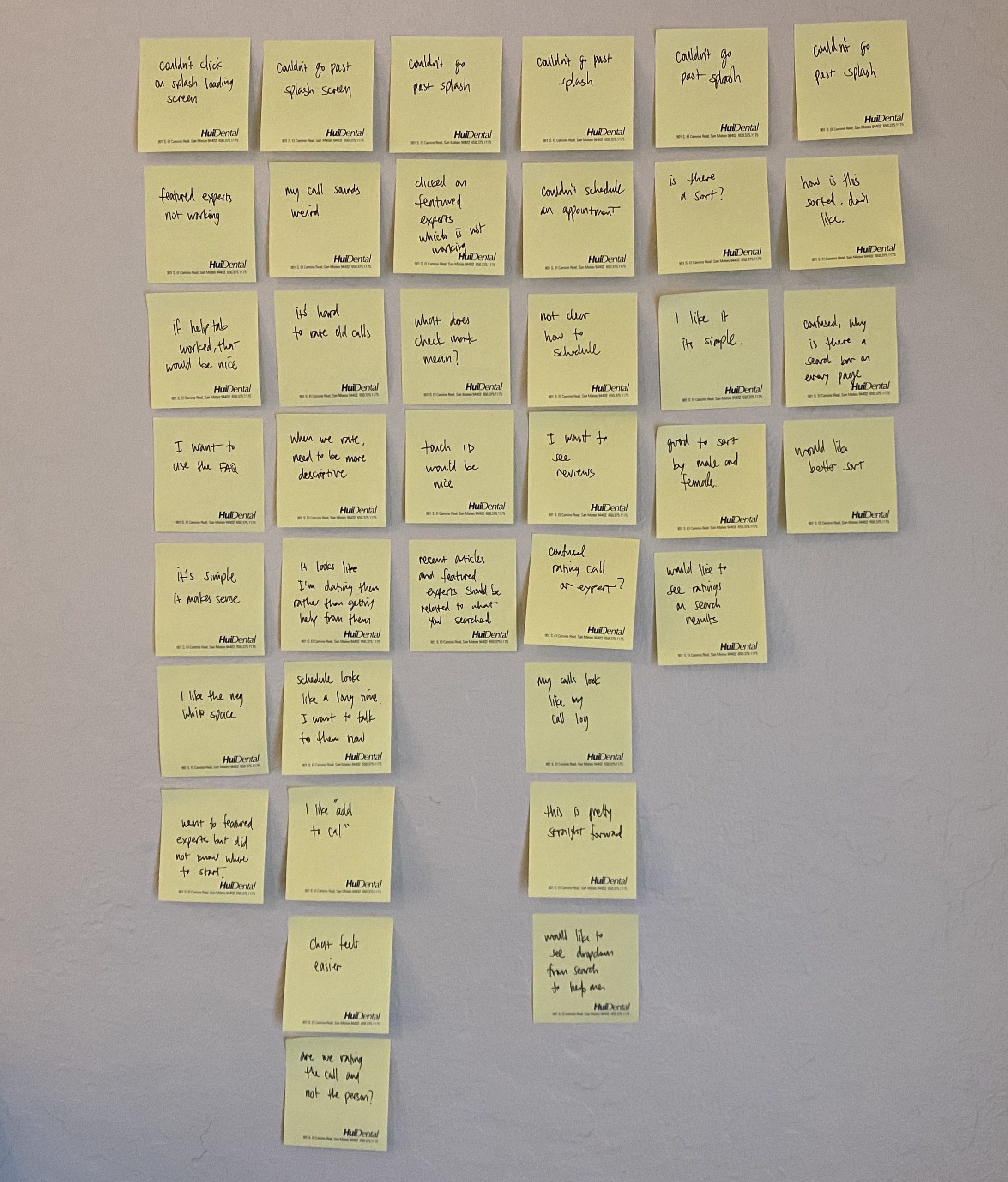
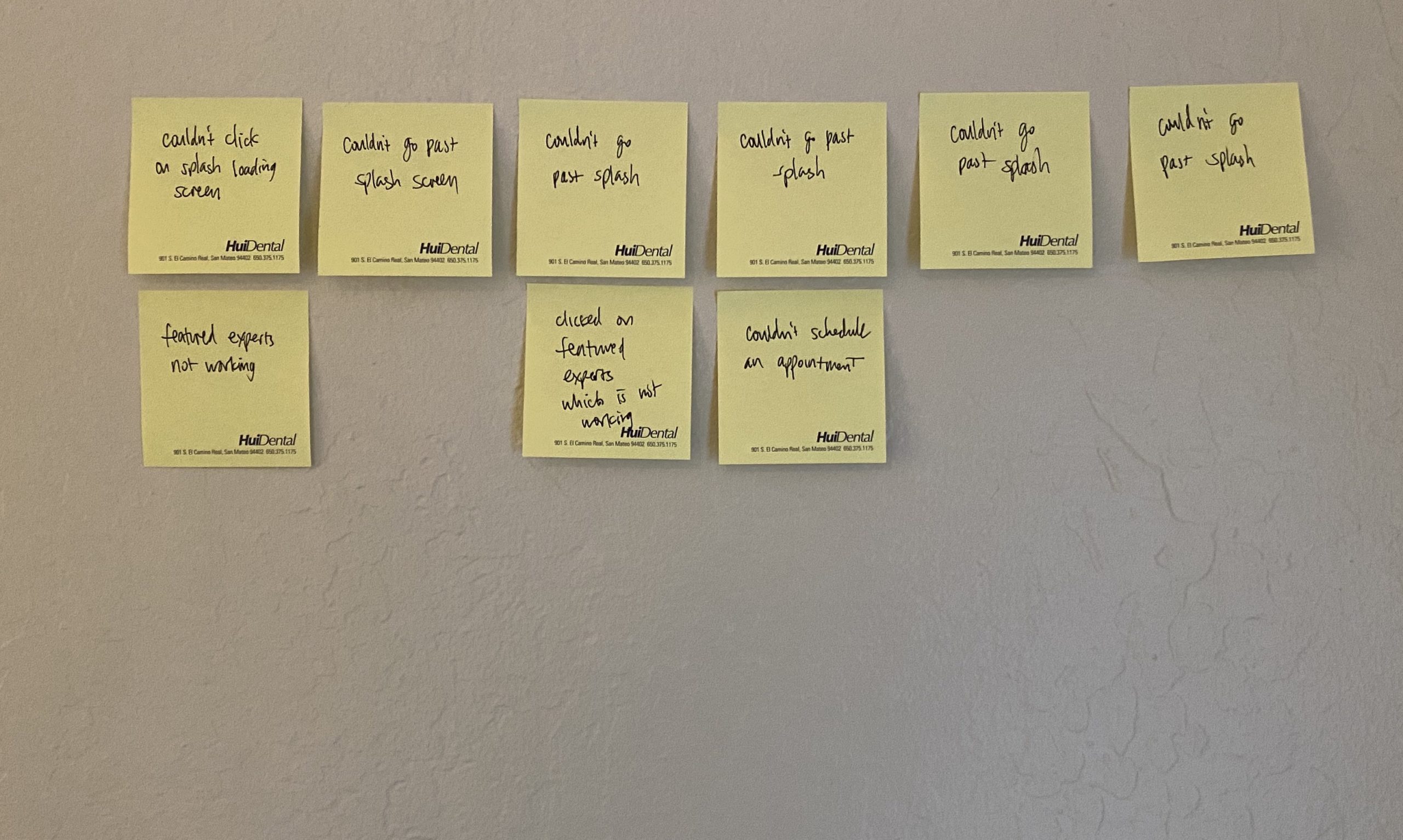
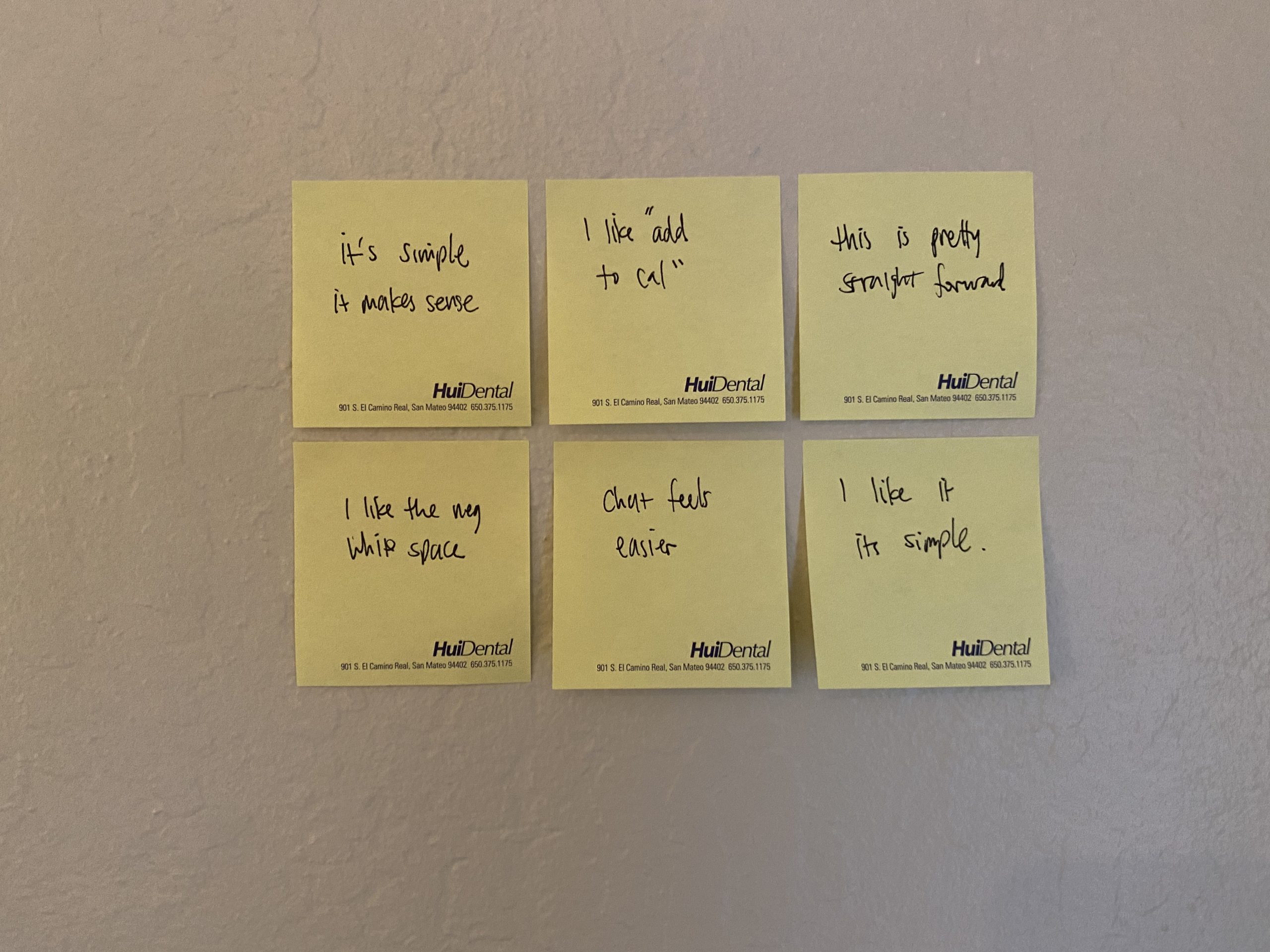
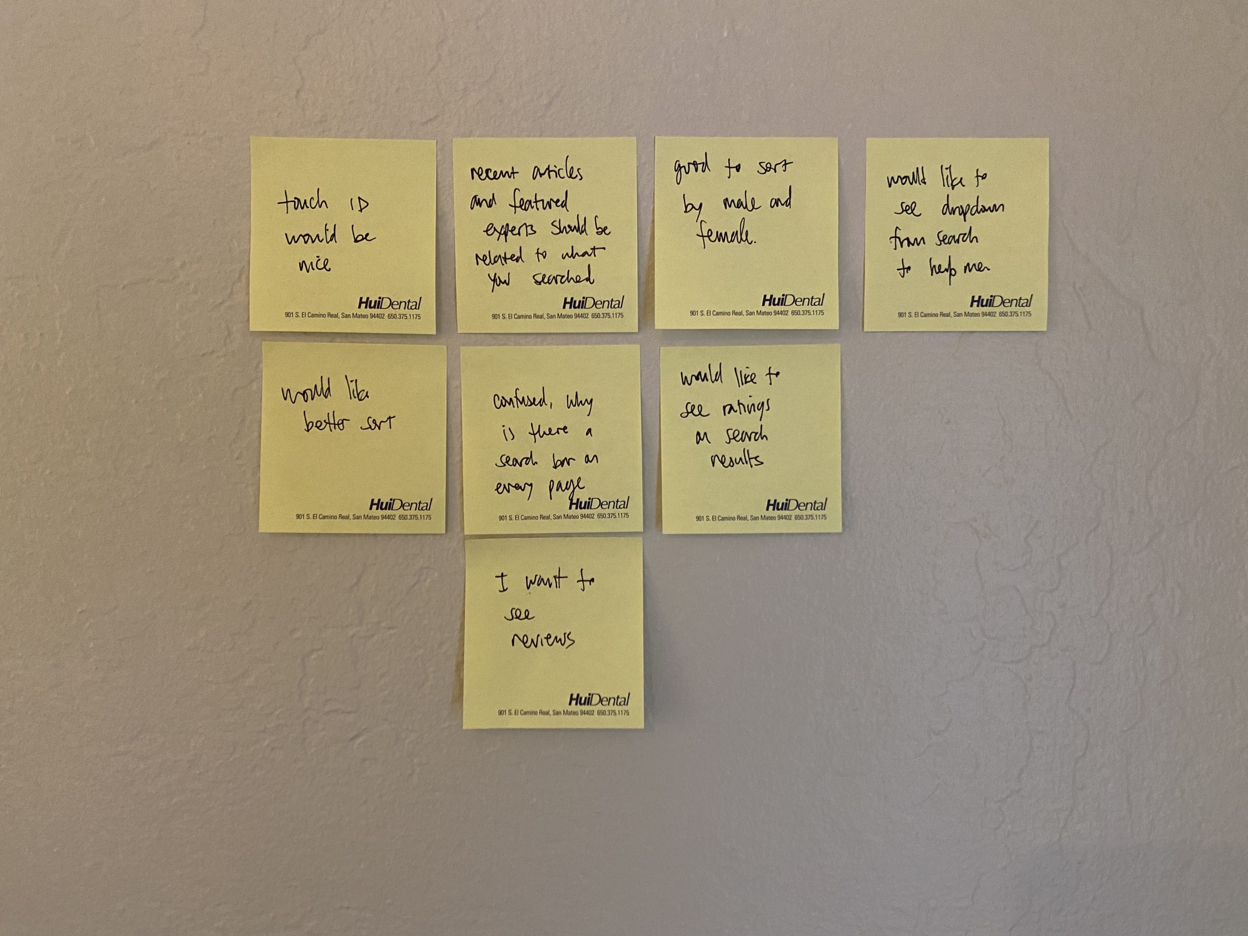
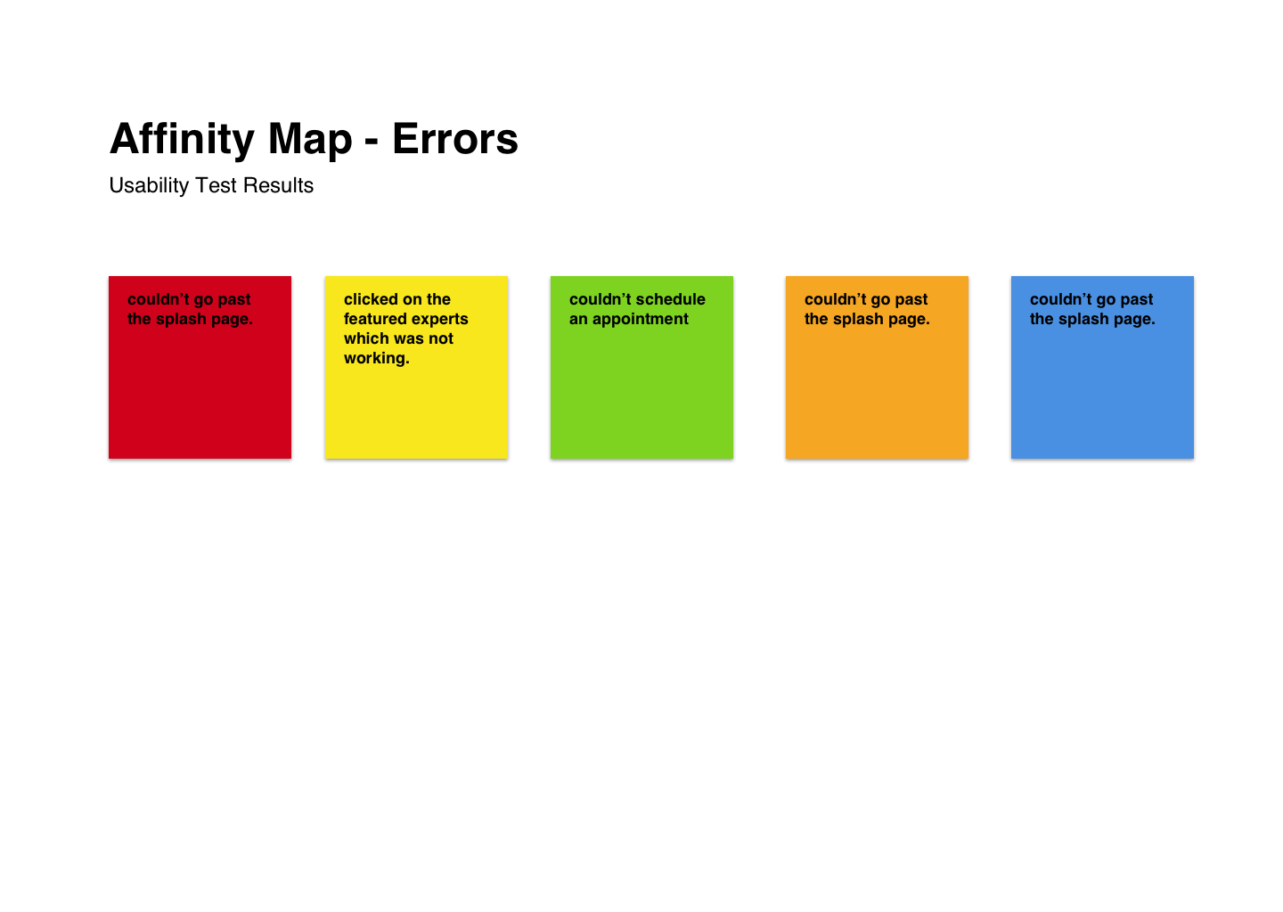
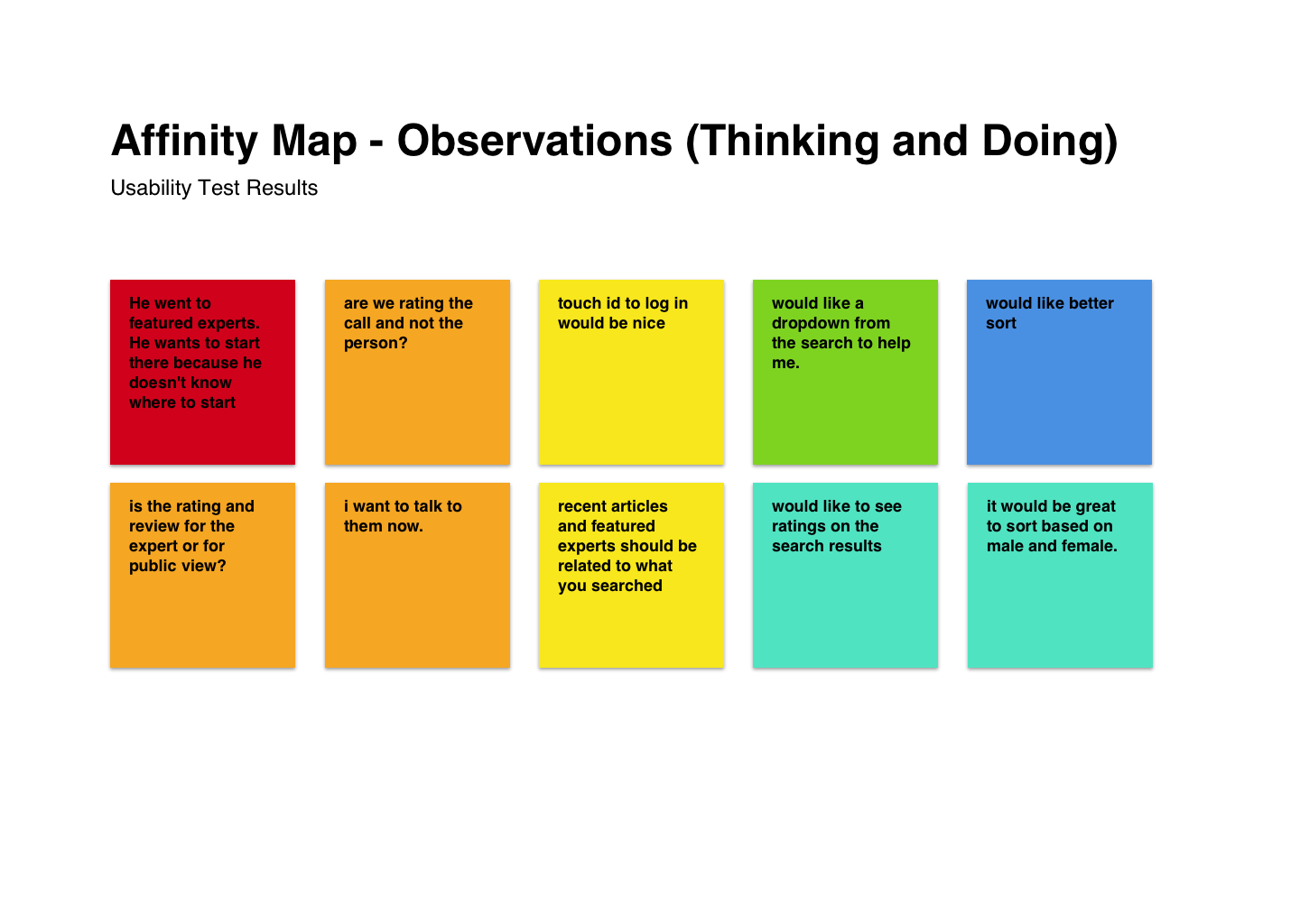
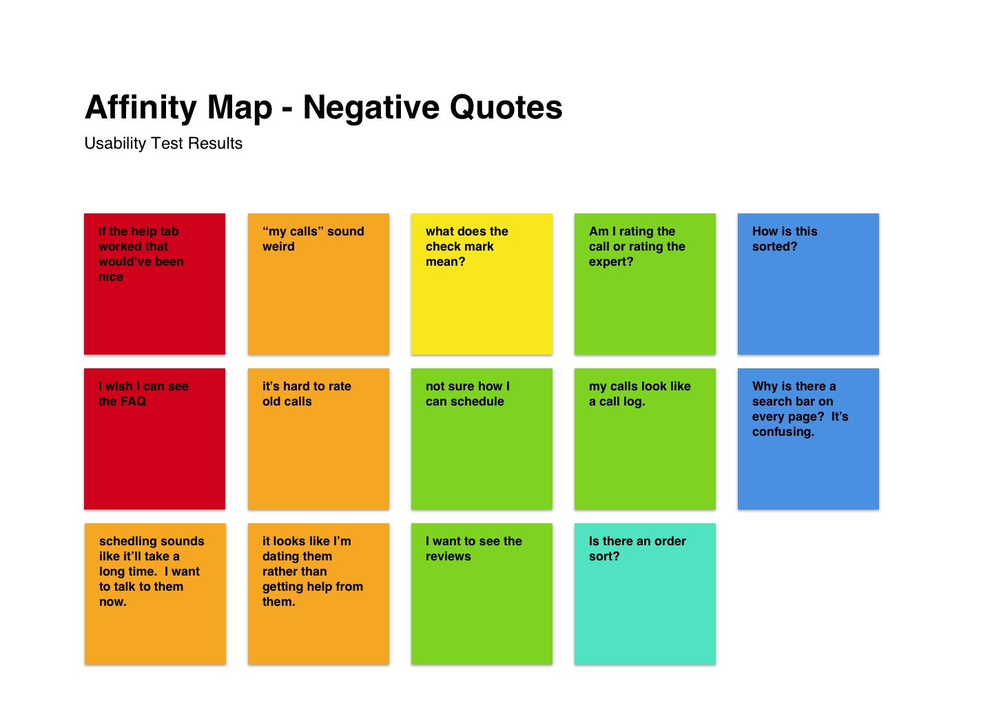
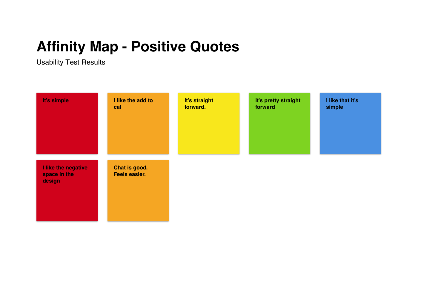
Through the discovery phase of interviews and testing, I collected various data including problematic errors, negative and positive quotes, errors and general observations.
Usability Testing and Affinity Mapping
Through the discovery phase of interviews and testing, I collected various data including problematic errors, negative and positive quotes, erros and general observations.
Usability Testing and Affinity Mapping
Through the discovery phase of interviews and testing, I collected various data including problematic errors, negative and positive quotes, erros and general observations.
Usability Testing and Affinity Mapping
Through the discovery phase of interviews and testing, I collected various data including problematic errors, negative and positive quotes, erros and general observations.
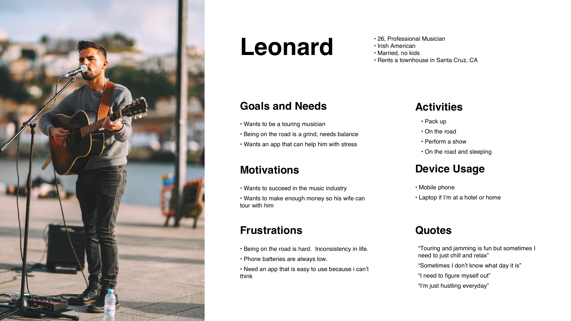
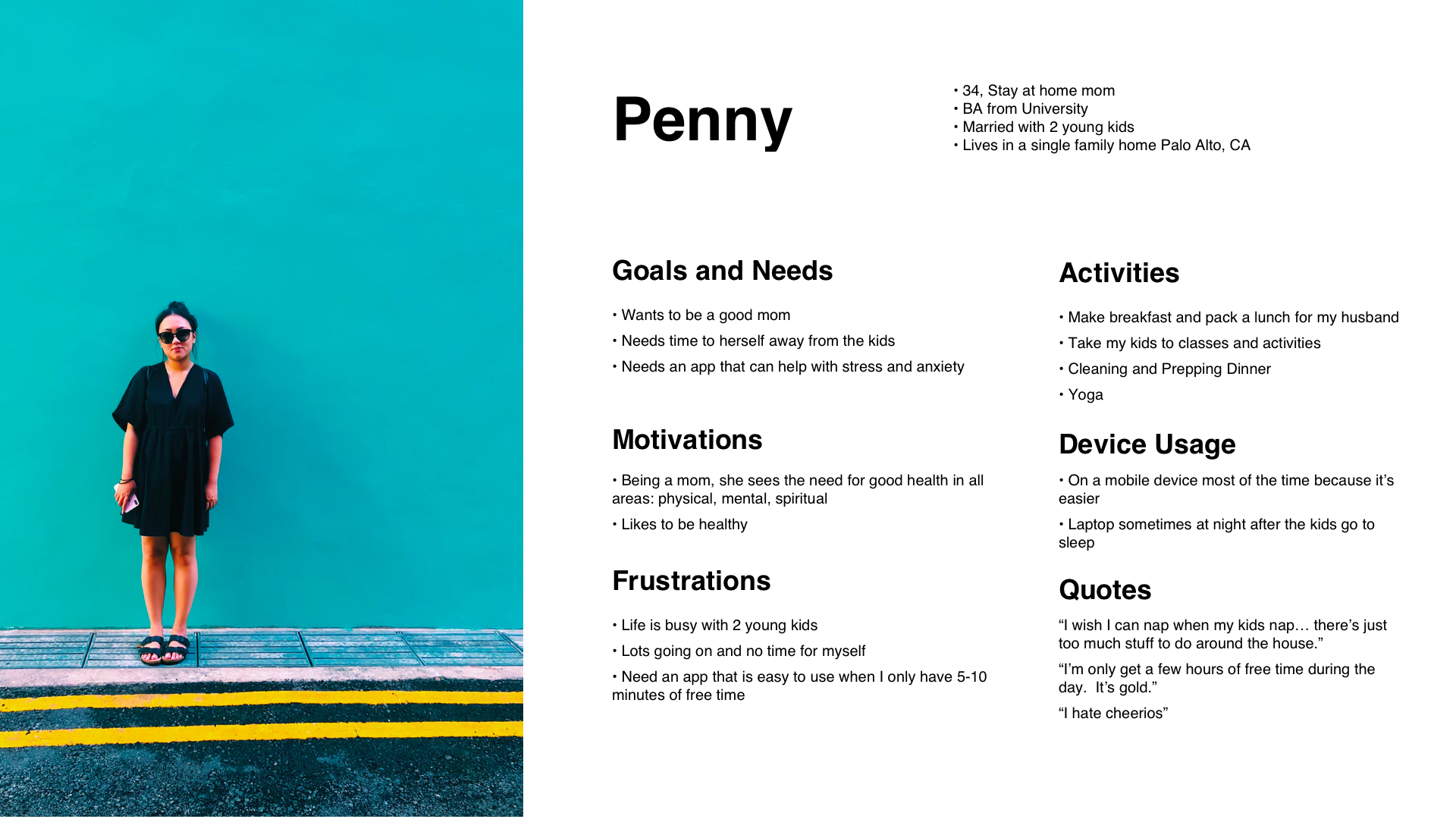
Personas
After some user testing and gathering data, I created a few personas.
User Stories
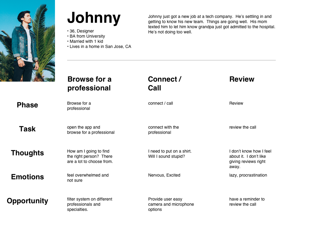
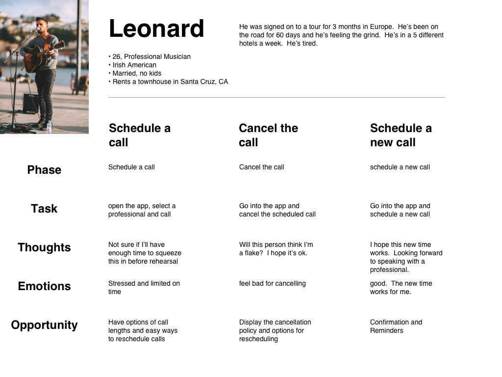
Using the personas created, I mapped out some journeys and flows.
Information Architecture
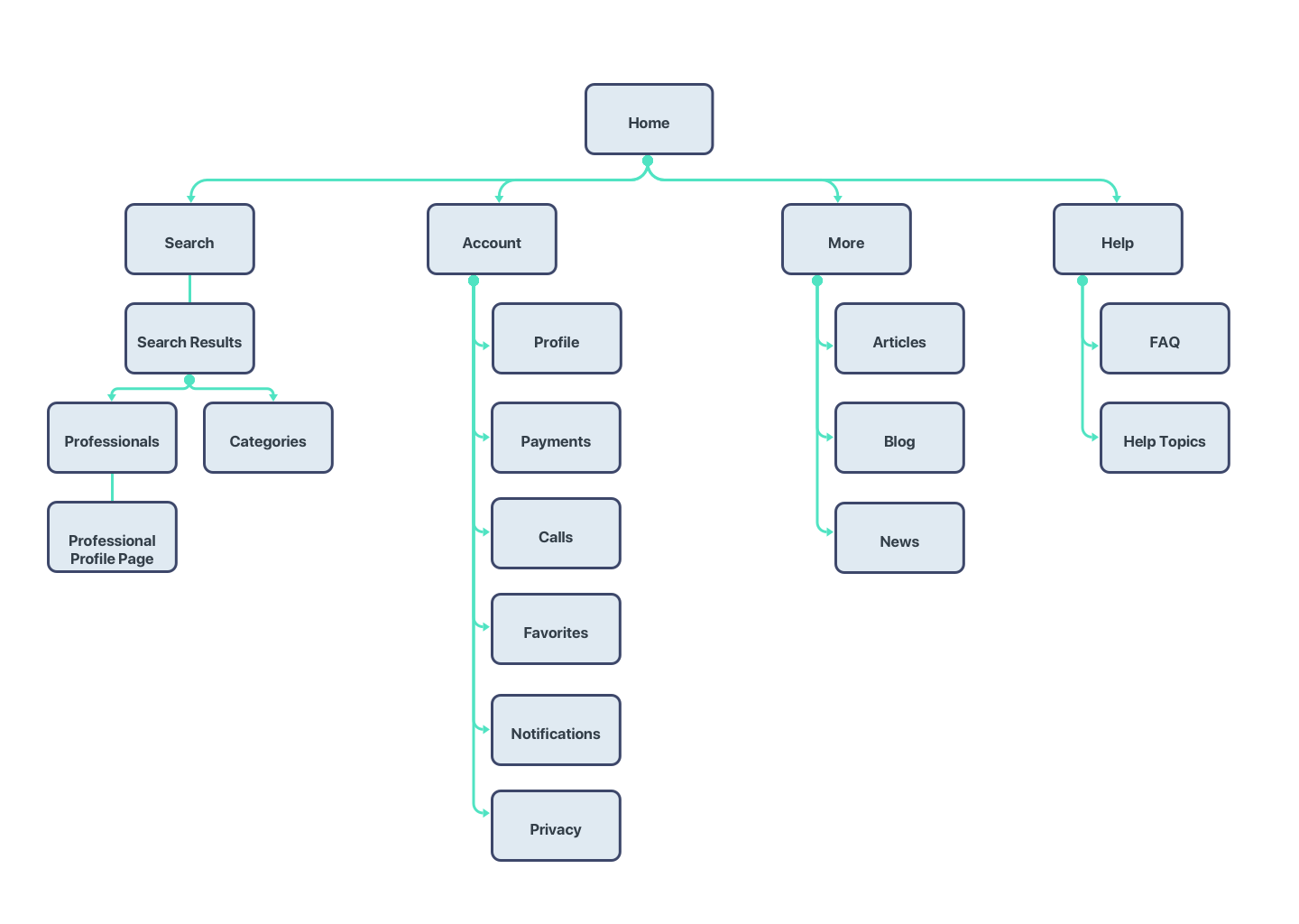
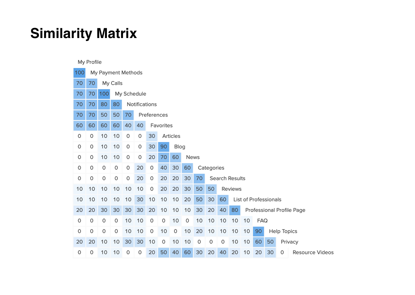
I came up with a site map that is based on the user needs. I did an open cart sort and found that most users' insights were mostly aligned with my original site map but with some variables.
Sketches and Wireframes
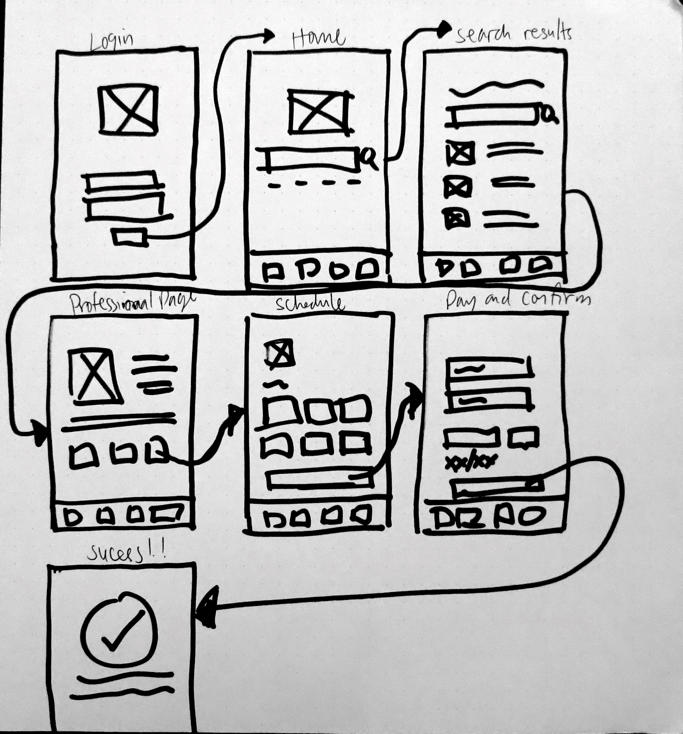
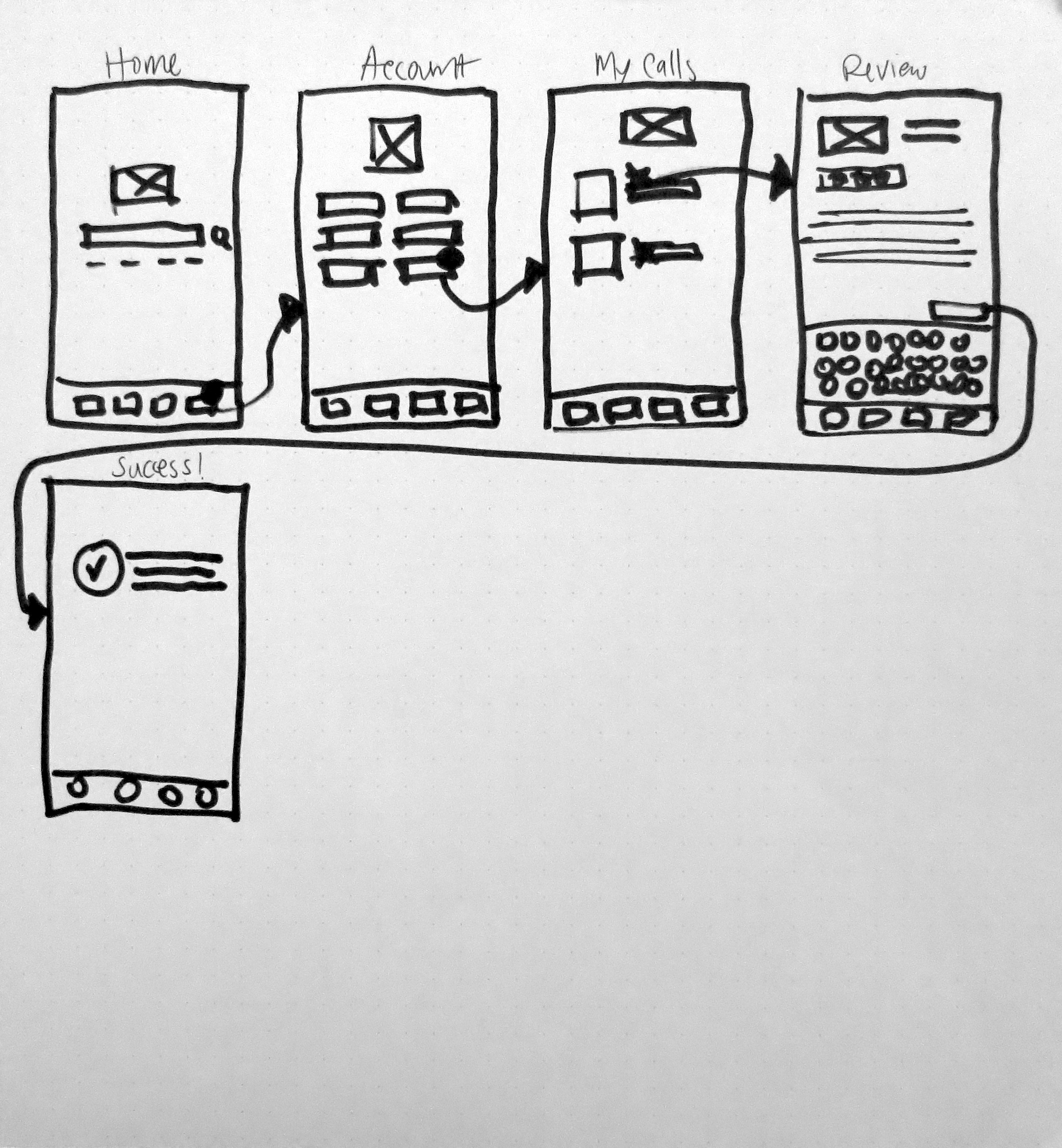
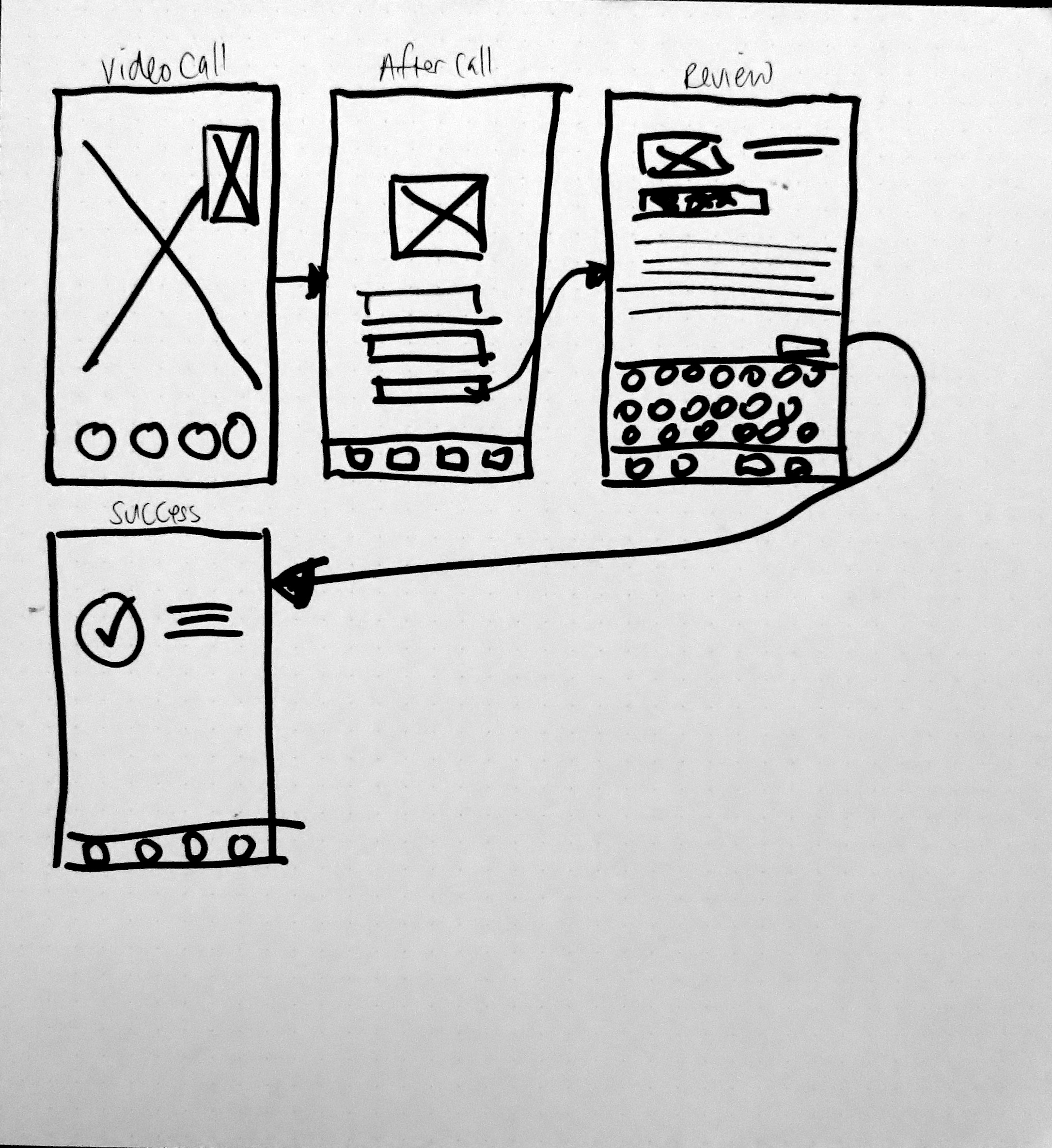
I started with a sharpie and paper sketching out what a possible flow would be for searching and scheduling a professional. I worked on the onboarding and highlighted the key features.
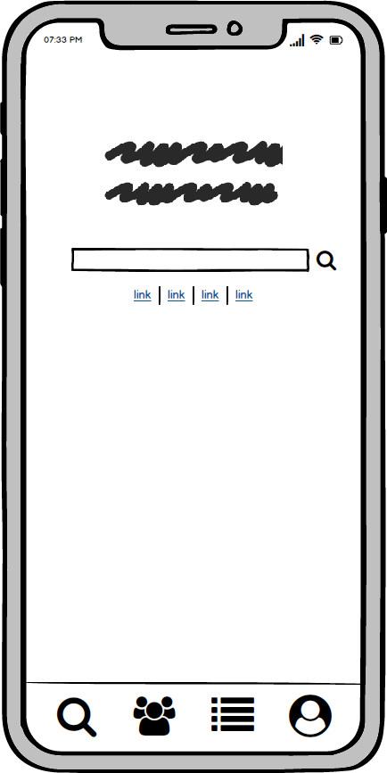
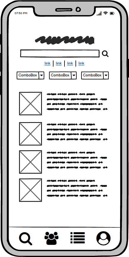
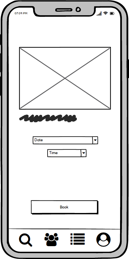
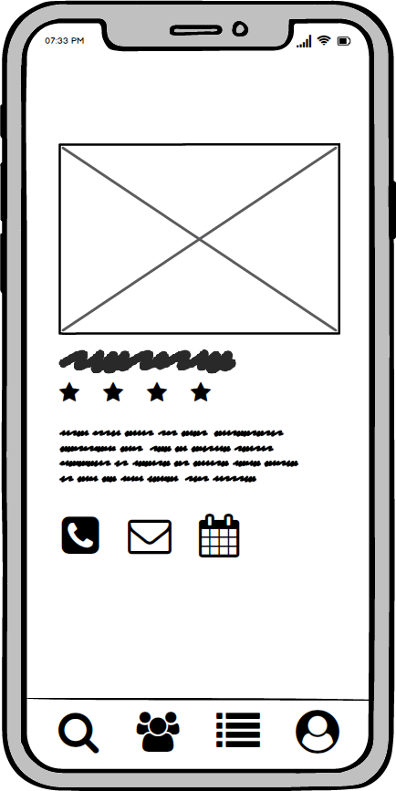
Mockups
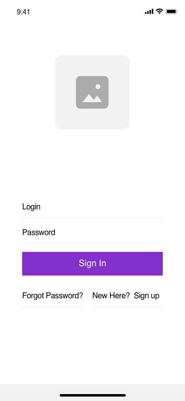
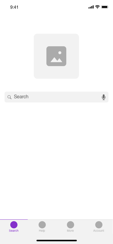
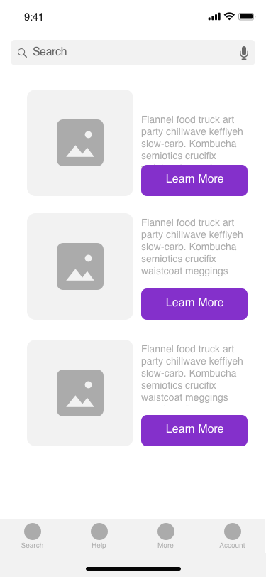
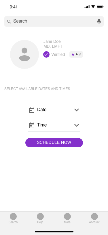
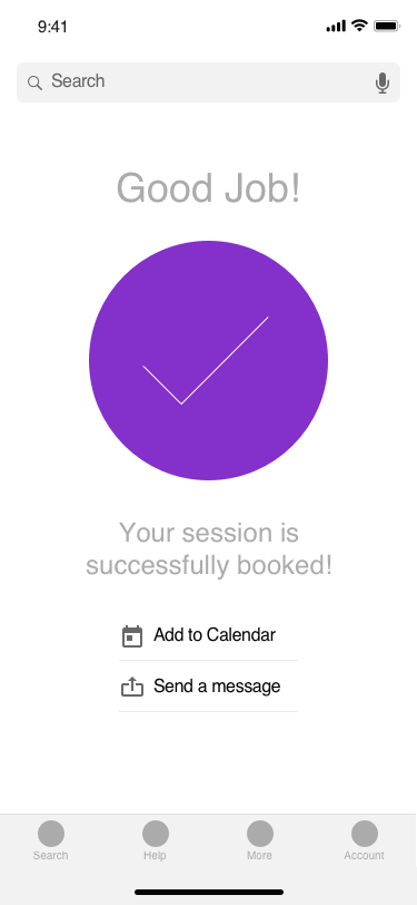
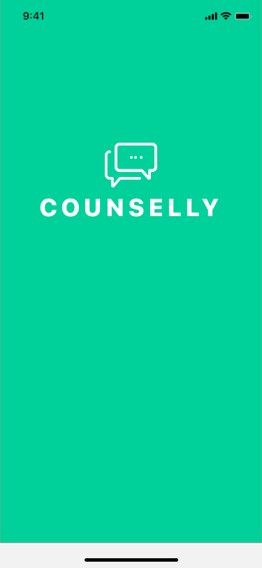
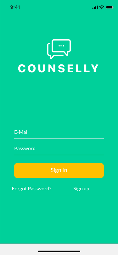
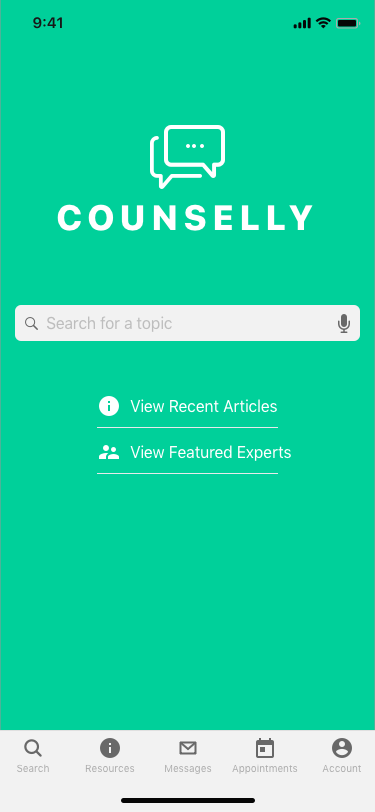
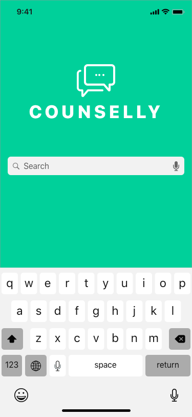
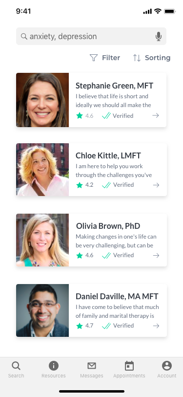
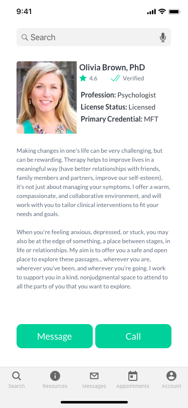
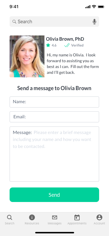
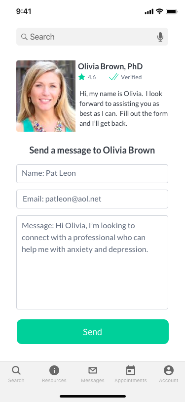
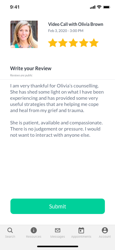
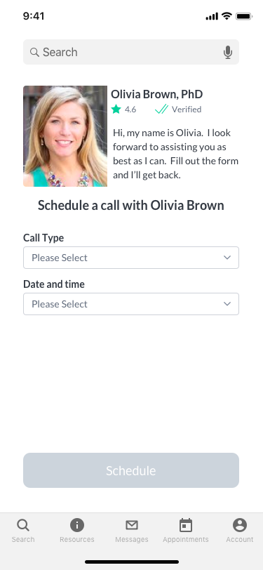
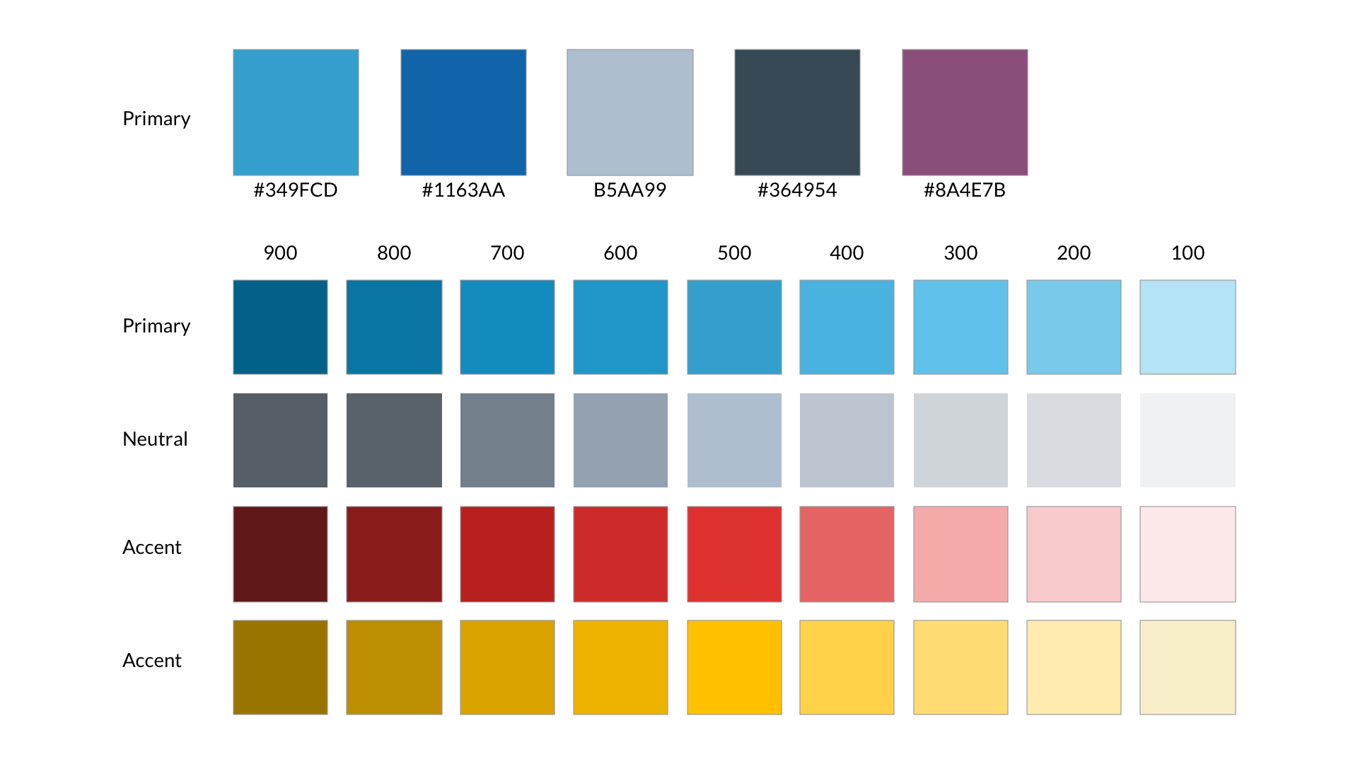
Moving on from wireframes, I chose my initial color palette, fonts and icons. Considering they were low fidelity, I made a UI change and adjusted the color to be more invited and less bold.
User Testing and Design Collaboration
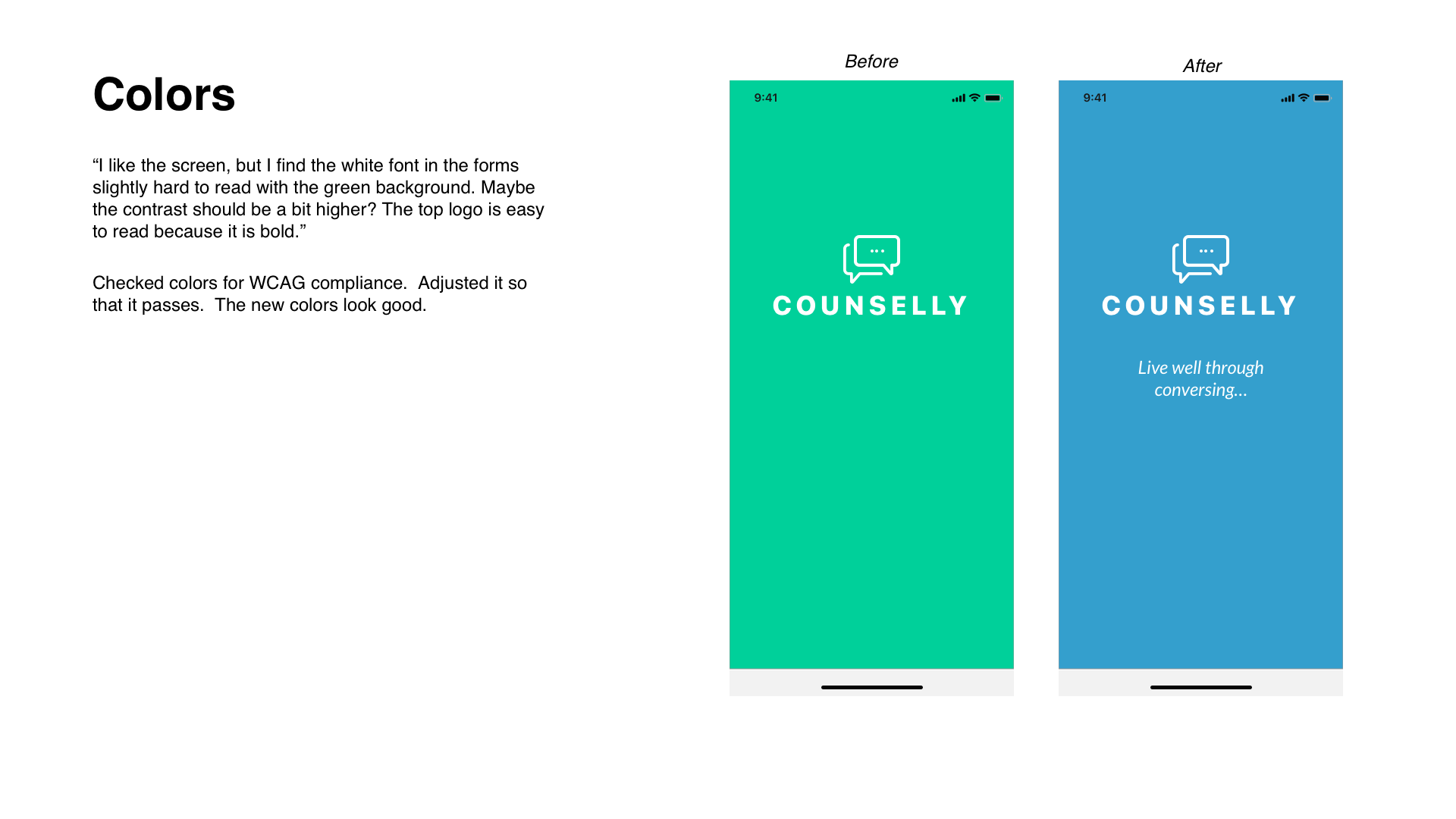
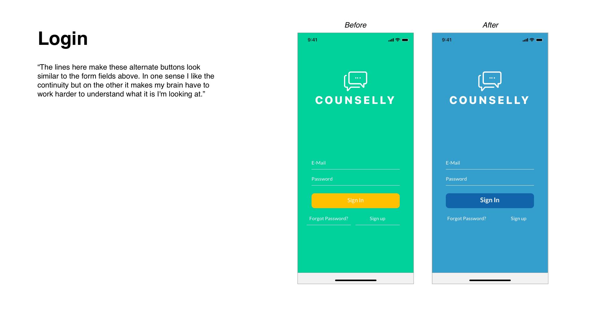
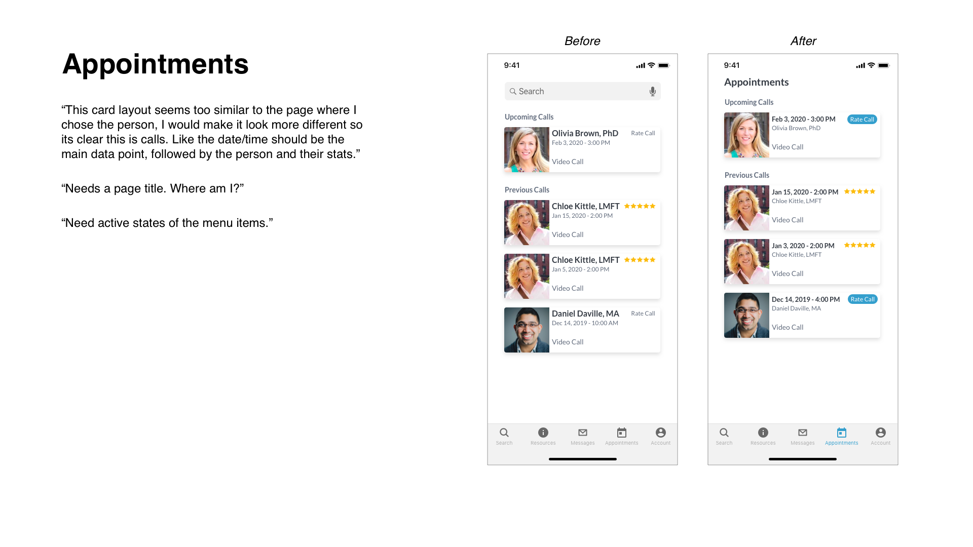
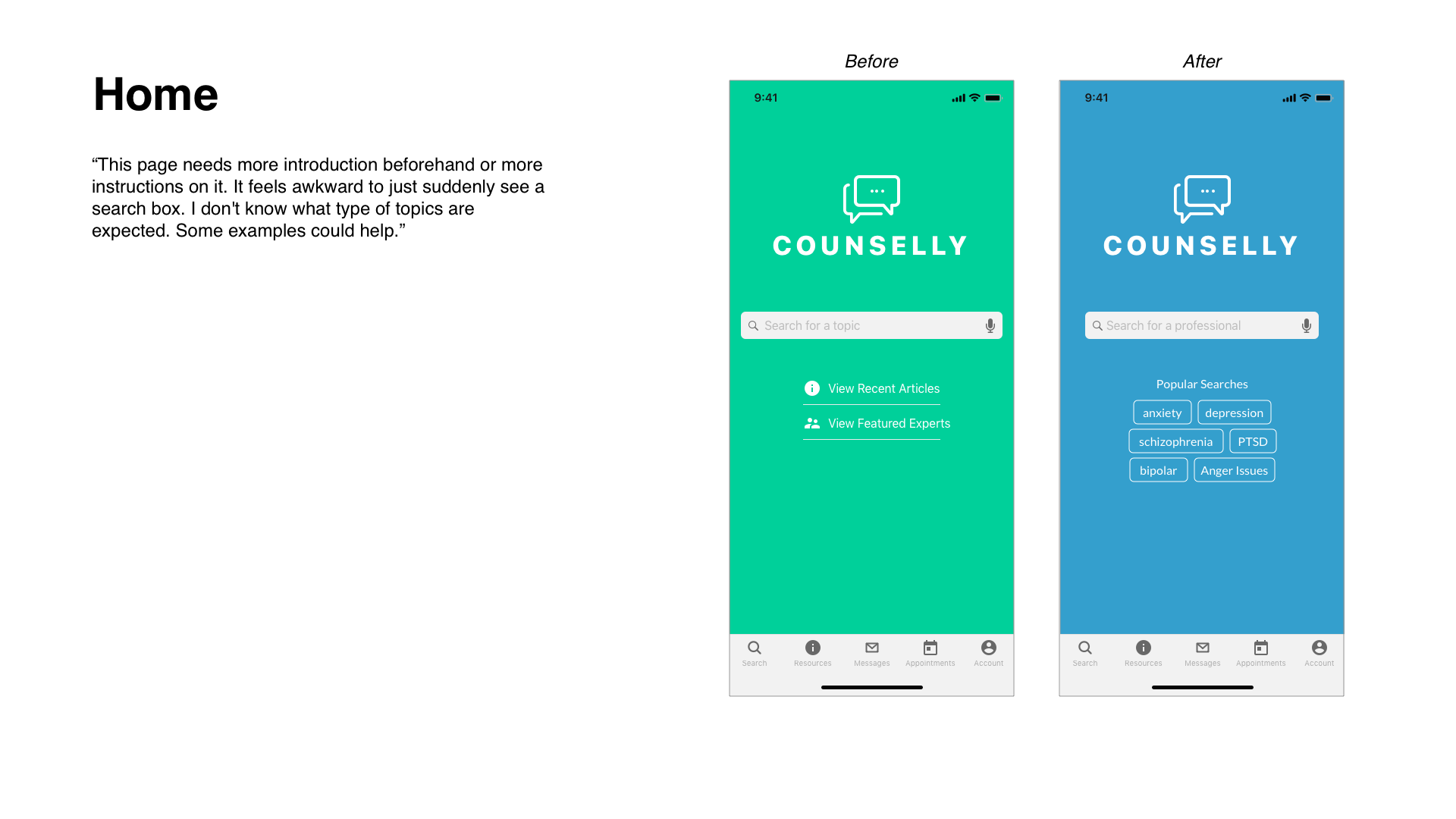
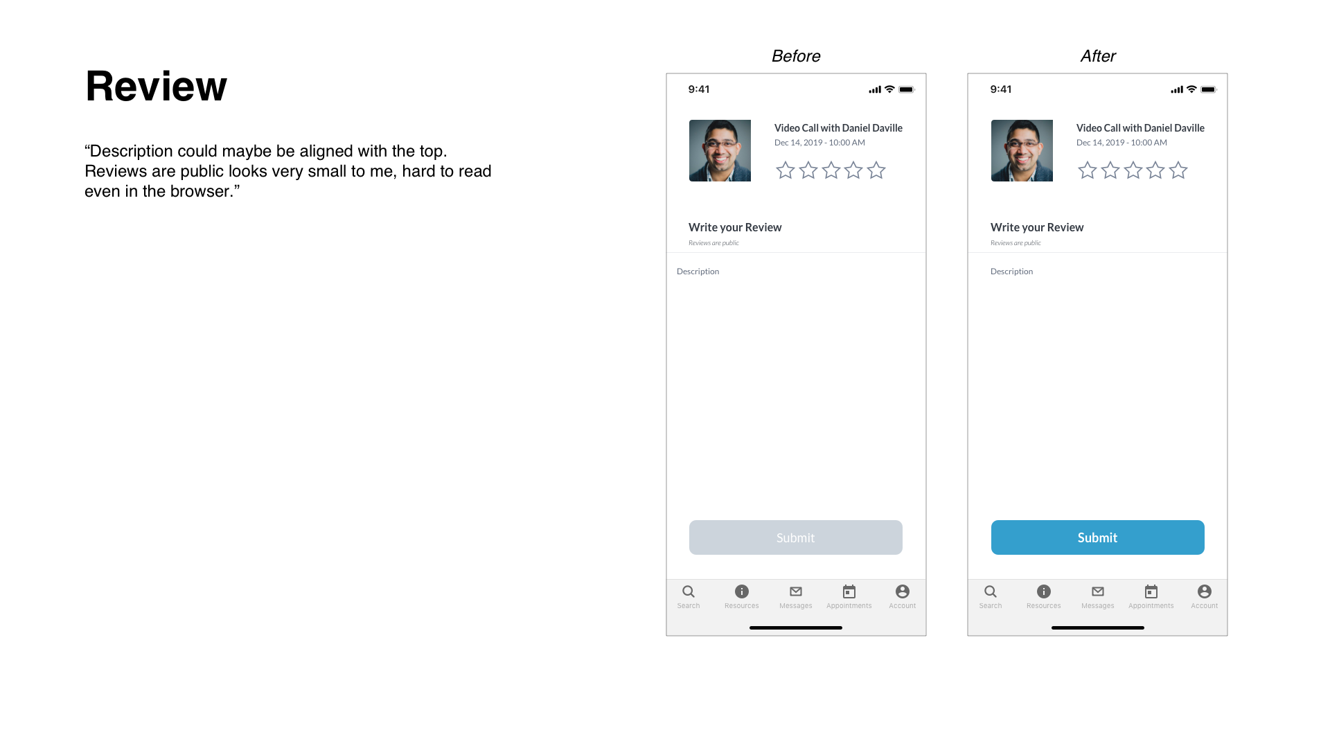
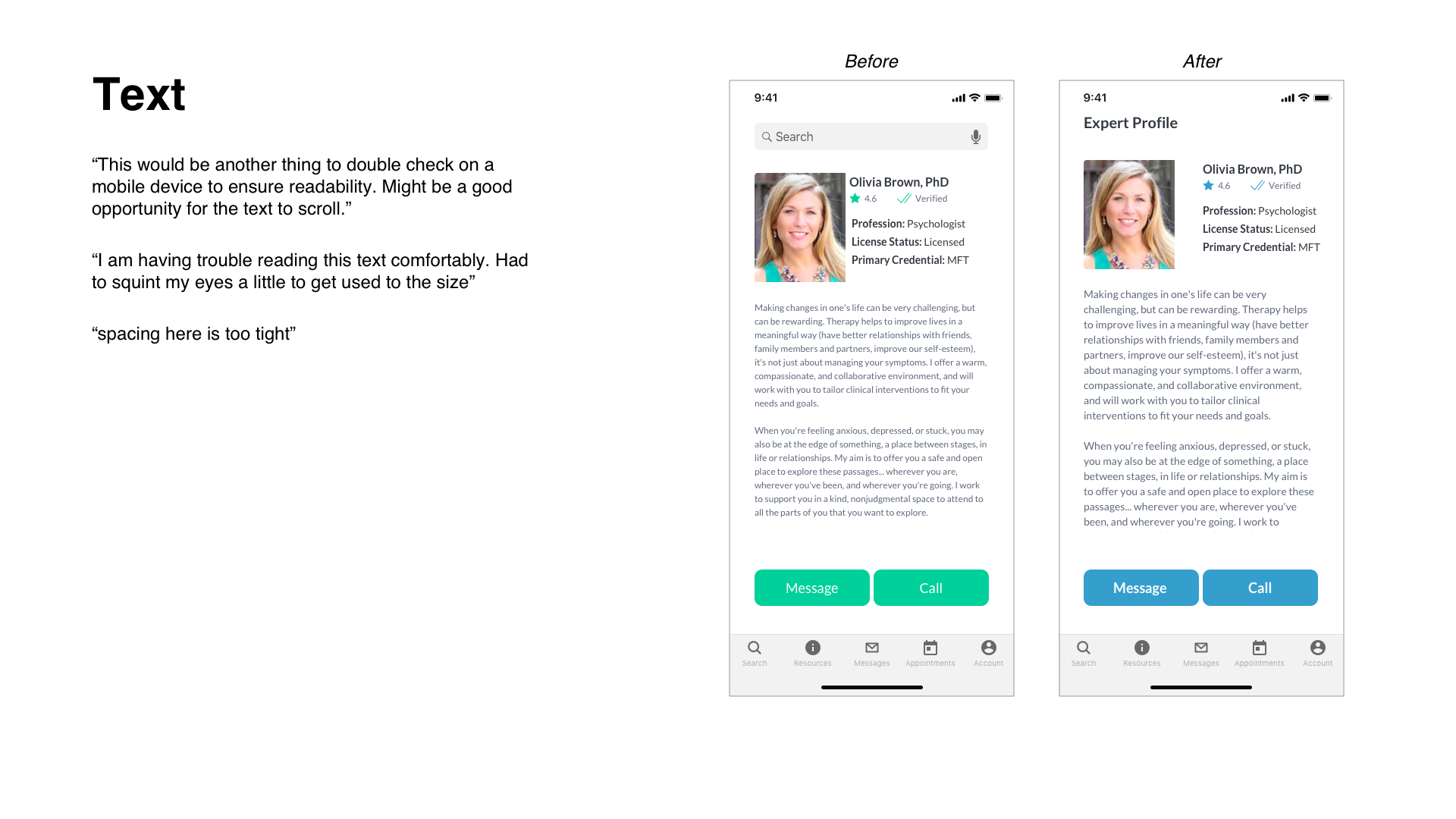
After some feedback and testing, I got some good pointers. I failed on the colors because they did not meet the WCAG compliance. I adjusted colors, fine tuned the navigation and buttons and cleaned up the text.
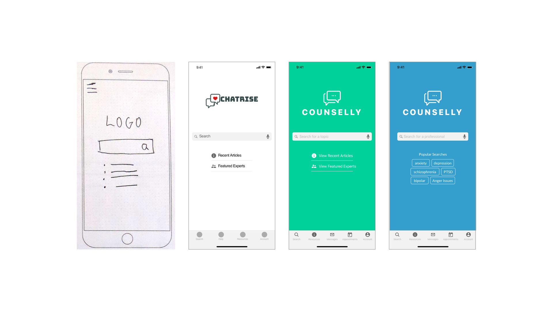
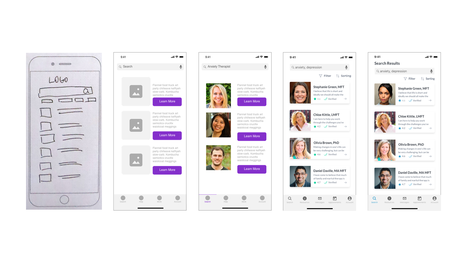
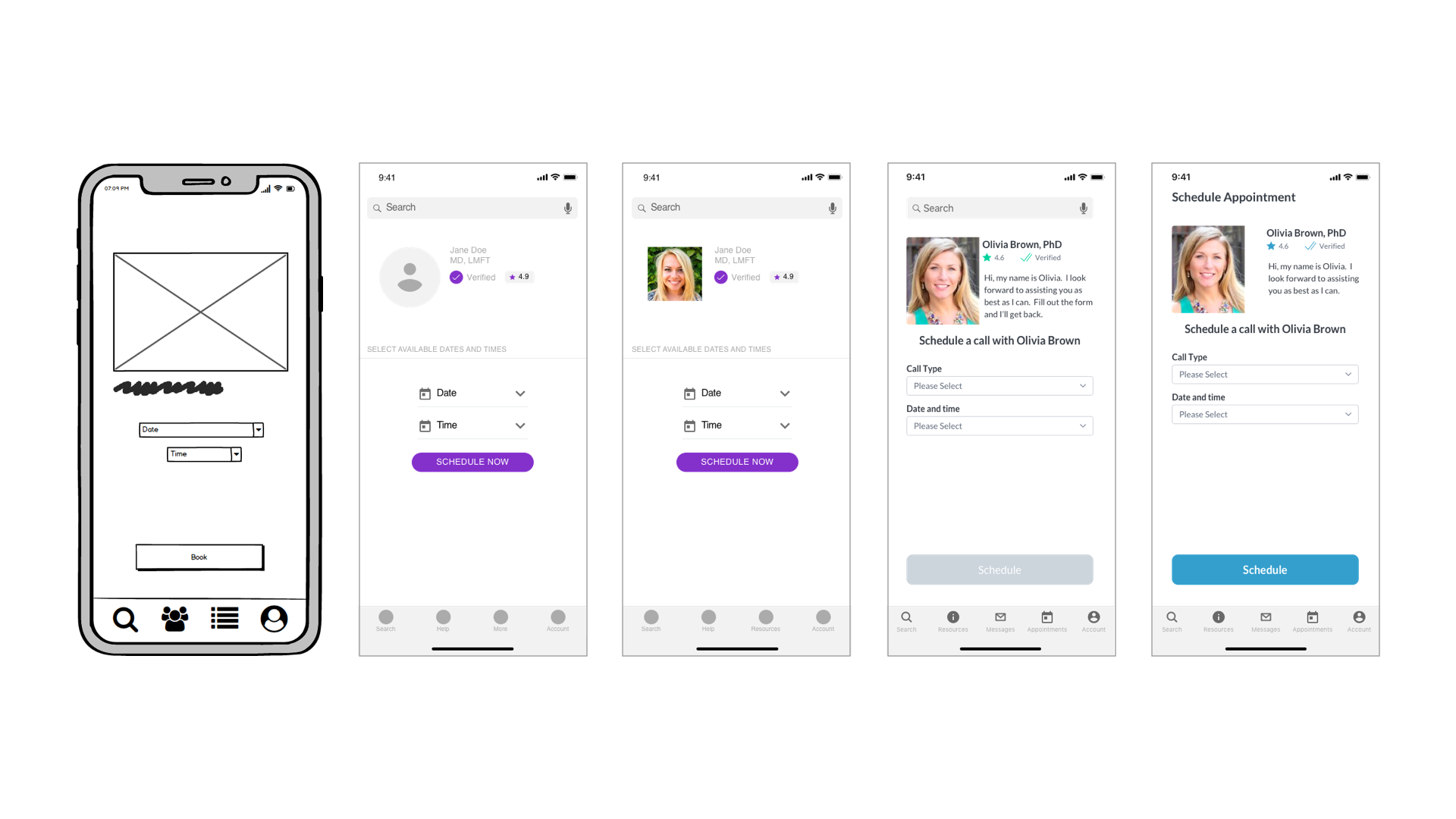
Mockup Journey
I started on paper with no idea where I would end up. As you can see, I had some drastic changes along the way. I was exploring names for the app, colors and layout.
Design Language System
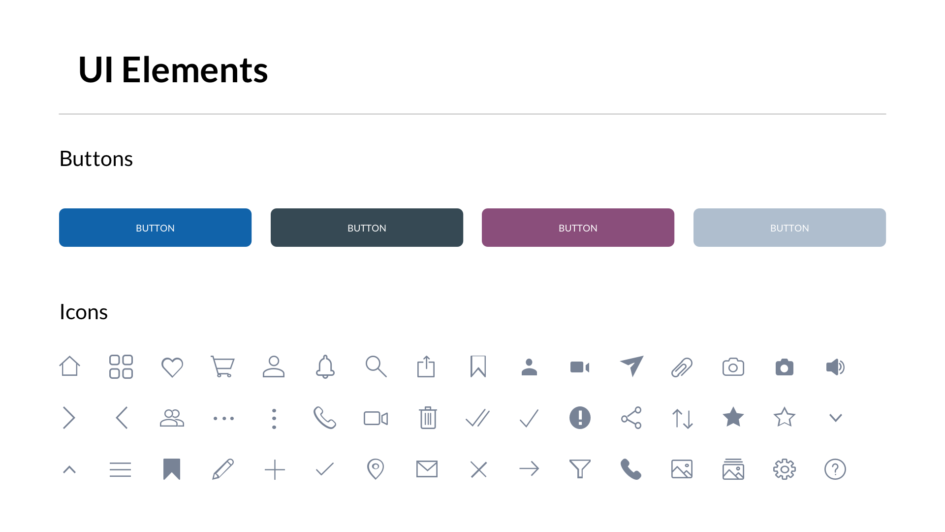
Here are some colors, elements, icons and typography used in the app. I also included some imagery for inspiration during the creation process.

Final Design Solutions
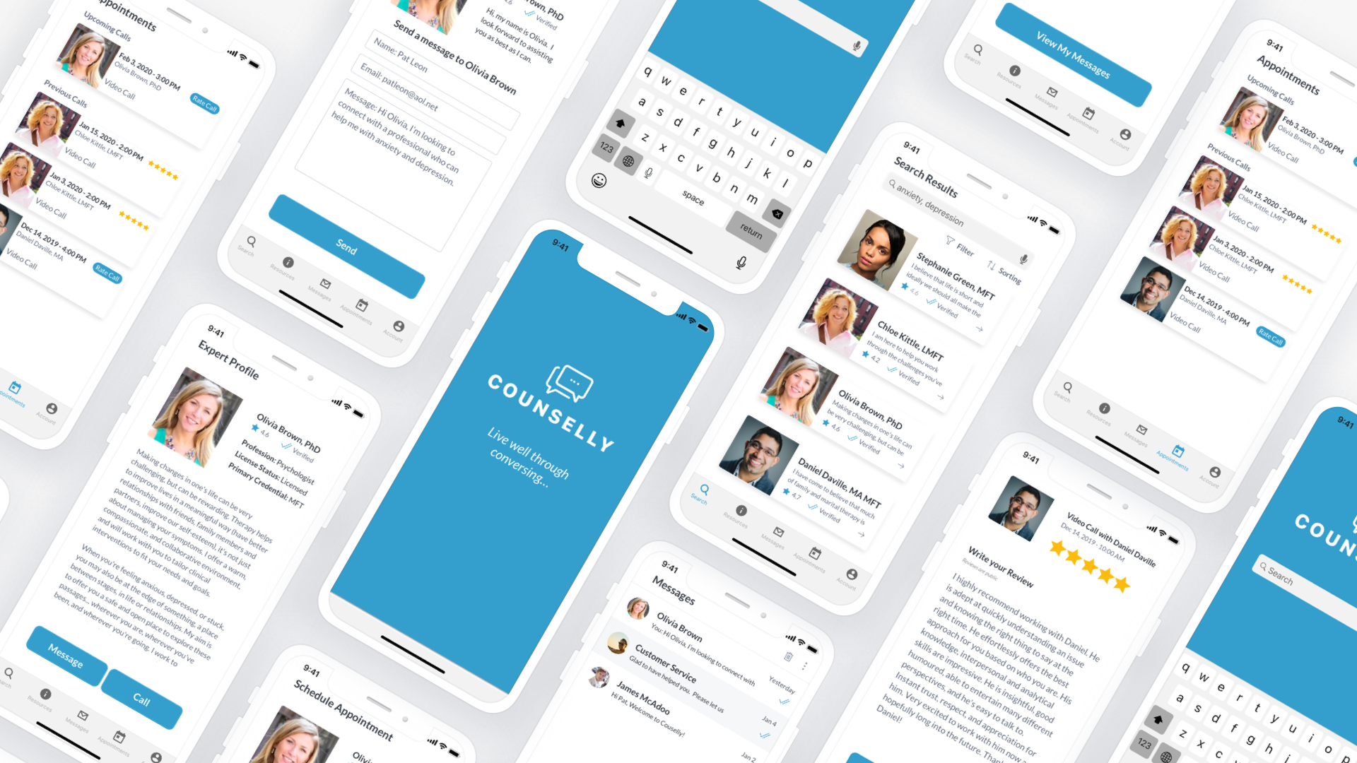
After much iteration, I reached a final design solution. I'm sure there will be more iterations in the future. It was important to get user testing and check accessibility compliance. The colors, text size and contrast works much better.
The initial research findings resulted in users wanting a simple and easy way to navigate to a professional. It was also important that these professionals were verified, certified or trained. Adding the verification badge by the professional was much needed.
Retrospective and Lessons Learned
1. Learnings
I definitely learned a lot through the research and design process. I gained more knowledge on the subject and discovered what users needed and wanted.
2. User testing
Though I was able to get a handful of users to test, it wouldn't hurt to have more. It was good to get feedback from users that span across different industries, demographics and walks of life. Also not speaking too much during an in-person usability test is ok. I need to work on letting people figure things out and struggle a little bit.
3. Accessibility
I changed the UI and colors a few times due to accessibility. I was pretty set on that green but it did not meet WCAG compliance. I could have checked colors earlier in the process.
Selected Works
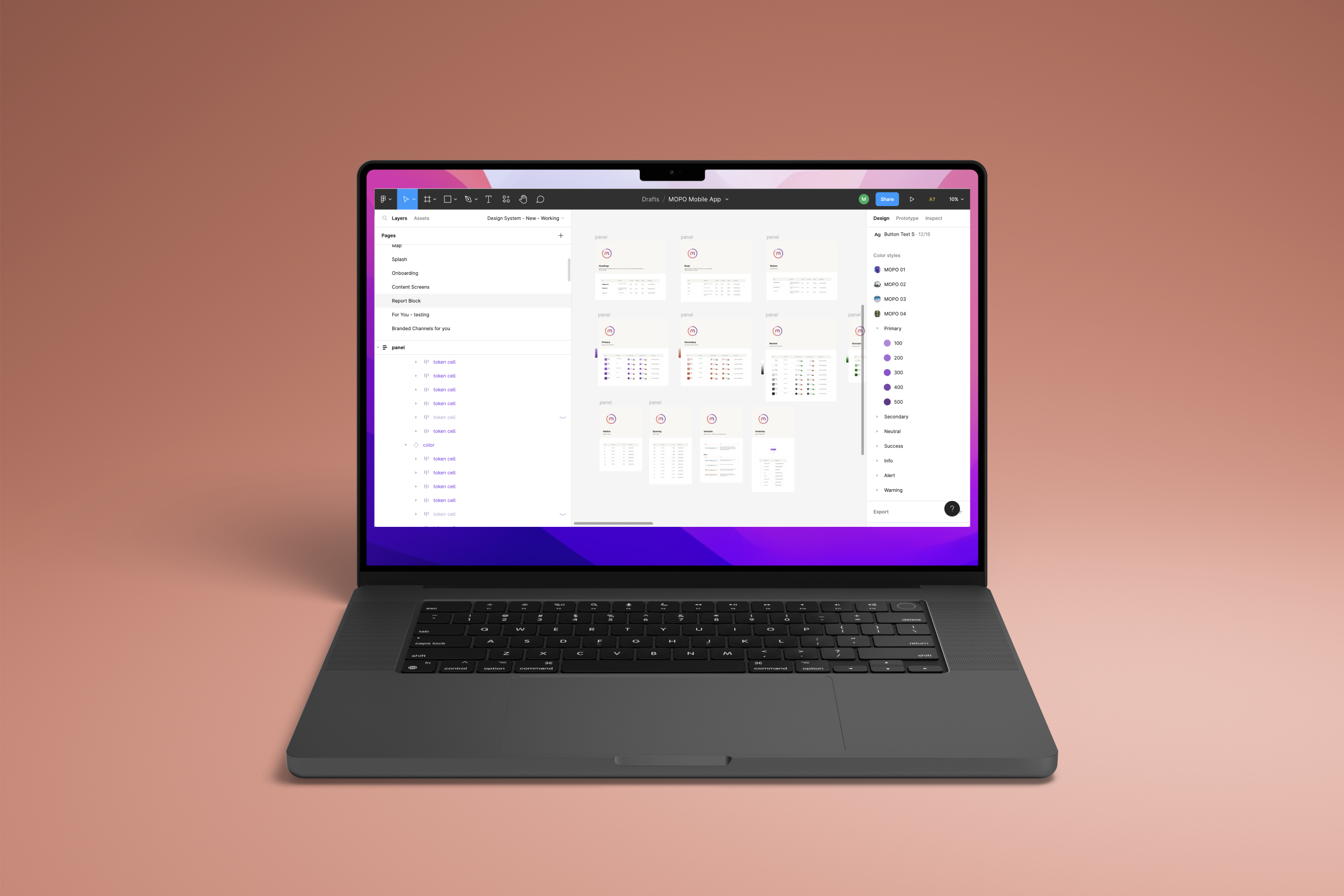
MOPO Design SystemUX Design
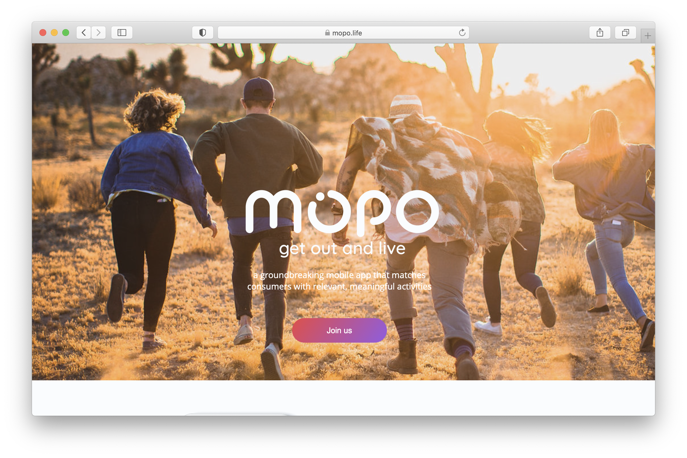
MOPOUX / UI Design
Chow TimeVoice User Interface Design
AbidePhotography

Tiny PrintsCommercial Photography
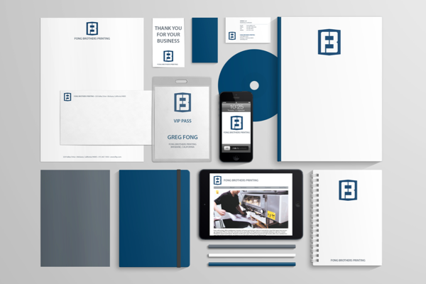
Fong Brothers PrintingBranding Design
